MTG Tracker 5.9

It’s been a while since the app became version 5.X, hopefully this will be the last update before we move to 6.0, which will include material design.

But let’s focus on this release. Commander 2014 is about to hit the shelves and here is another update of MTG Tracker.

MTG Tracker on Google Play

ChangeLog

  • Added Commander 2014
  • Added Duel Deck: Speed Vs. Cunning
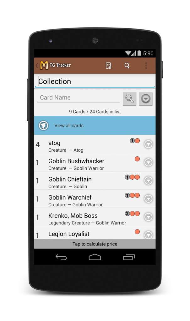
  • Improved filters on card lists (notice of filtering and option to clean the list)
  • Fixed CMC sorting (cards with 10+ CMC were out of order)
  • Fixed name of Valor, Call of the Herd & Altar of Dementia

Card Lists in detail

Until now, there was little to none information about if a list was being filtered or not, just the amount of cards displayed Vs. the total cards in the list.

In previous versions, the filter criteria was shared among card lists, which was a bug that has been solved. Now each card list has now its own criteria.

Also, filters are now cleared when you exit the card list. Before this version they were stored even among application runs, bringing lots of confusion. Combined with the previous bug, it was quite confusing. I hope to have solved all that issues.

Finally, there is a new easy & prominent way to clear the filter of a list as soon as some cards are being hidden by the filter.

device-2014-11-07-162517_framed (3)

Happy taping.

GDGFest Dublin & Playful Design

Playful design is a term that comes from the games industry, it means juiciness, it means maximum feedback for minimum input, it means delight the user.

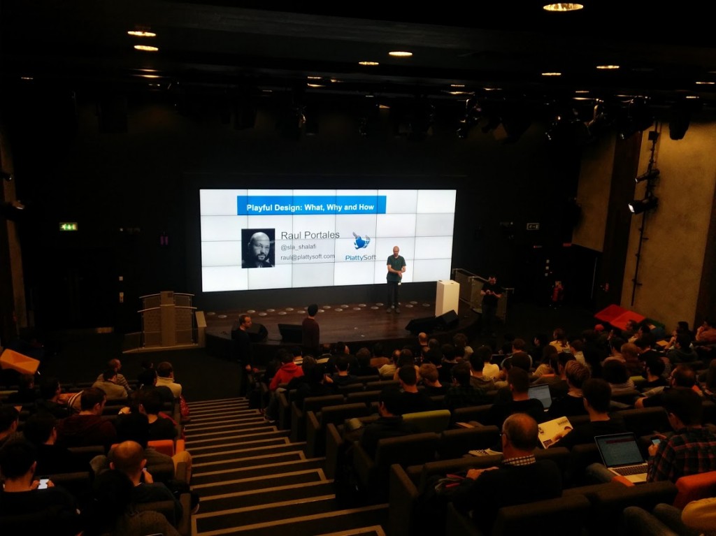
In my talk at GDGFest Dublin,  I talked about animations, transitions and how playful design fits into material design.

Playful design works at subconscious levels on the users, they prefer to use your app to another one, but they won’t be able to tell why.

This has been one of the big differences between Android and iOS: How the default components managed the transitions. It seems minor, but devil is in the details. With material design Google has made a big statement of just how important playful design is.

It is very easy to improve the playfulness of any app with very simple animations that are available on the Android framework. That will make your users happier, without them being able to tell you why.

The slides of “Playful Design: What, Why and How” are available on Google Docs.

IMG_20141101_122952

MTG Tracker 5.7

Another core set is here: Magic 2014 Core Set, and another update of MTG Tracker is here as well.

Apart from the new set, there are a few other improvements:

  • Added Magic 2015 Core Set
  • Improved format validation (deck size & number of cards)
  • Fixes in Tournament mode
  • Minur UI and navigations tweaks
  • Added setting to disable animations on the life counter
  • Stability improvements

In particular, I want to talk about the improvements on format validation.

Improved format validation

Until now the format validation checked if the cards were valid or not. Just that.

With this update it will validate that you don’t have more than 4 copies of any card (except basic lands and *cough* Relentless Rats)

It will also validate that any constructed deck has at least 60 cards, for unknown formats the lower limit is 40 cards.

Finally, for EDH, it will specifically check that you have exactly 100 cards (general included) and that you have one copy of each card (except, again, basic lands and Relentless Rats)

In future updates the restricted list will be added to vintage with proper validation.

MTG Tracker on Google Play

MTG Tracker 5.6

WotC has just released a new set designed for draft: Conspiracy. As any new set, it has new cards, and so, a new version of MTG Tracker is released.

MTG Tracker on Google Play

Changelog:

  • Added Conspiracy
  • Added Modern Event Deck
  • Added option “Import into List” on Card Lists.
  • Minor UI tweaks
  • Improved stability

A bit more in detail

So, in addition to including Conspiracy and Modern Event Deck, other improvements have been done.

MTG Tracker has migrated away from ActionBarSherlock and now uses the official ActionBarCompat and DrawerMenu. This visually only means that the icon on the top left shows three lines when it opens a menu and an arrow when it goes back. Subtle, yet important.

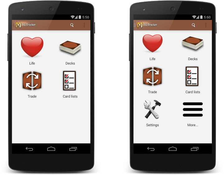
The drawer menu seems to be hard to discover, so now the dashboard adds two new items, one of them called “More…” which opens the side menu. You can compare the old and new dashboards and also see the difference in the action bar icon (arrow Vs. three lines).

dashboard_comparison

Some animations have been added to the card display and the life counter, they are meant to make the user experience more enjoyable with a more playful design.

When we added multiple lists, the functionality to import cards from a text file inside an existing list was missed. It has been added again, now named “Import Into List”

And a few bug fixes, specially crashes when browsing many cards.

cardshark_header

MTG Tracker 5.5

There is a new set coming out -Journey into Nyx- and as usual there is a new version of MTG Tracker, but it does not only add the cards from Journey Into Nyx and Duel Decks: Jace vs. Vraska, it also has some new features.

MTG Tracker on Google Play

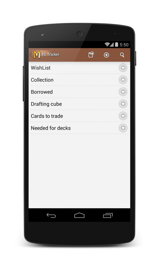
Multiple Card Lists

Many people was using collection and / or wishlist for keeping multiple lists by saving them and importing them again. That is quite inefficient, so now you can have as many card lists as you want.

Want a list for the top priority cards you want? What you have borrowed to someone? The cards in your Drafting Cube? Which ones you are willing to trade? The missing cards for a deck?

Now it is up to you, create a list, name it, and you can use it for whatever you want.

multiple_card_list

Playtest Improvements

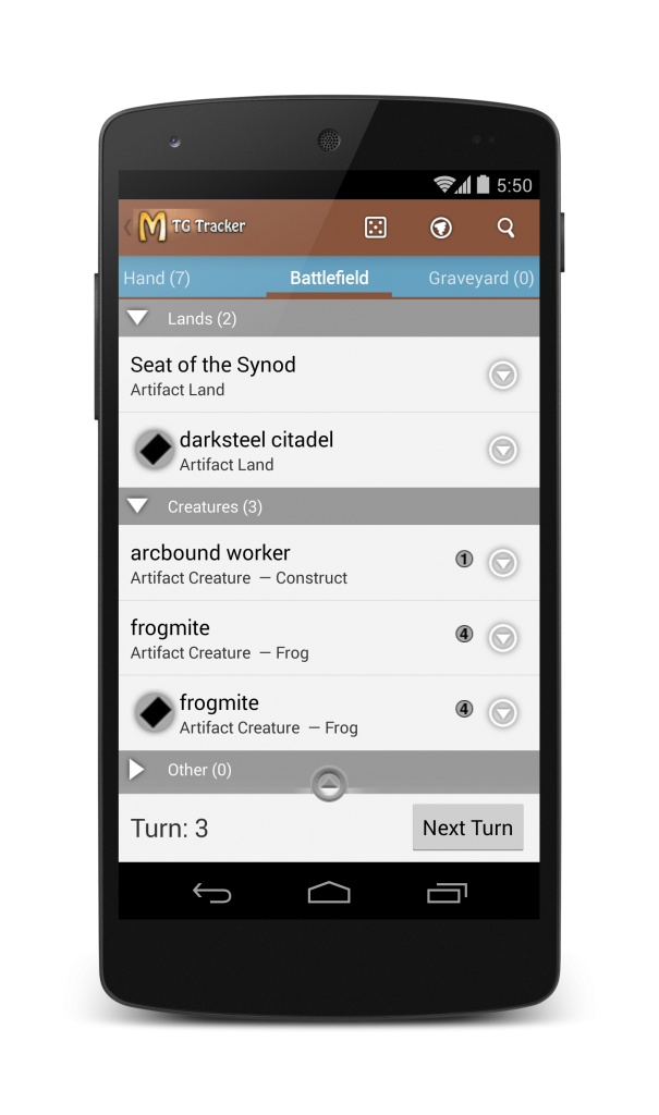
Playtest is nice, but there was no way to keep track of what was tapped and what was untapped. For quick tests, you can track it in your head, but that is far from ideal.

From this version you can tap / untap the cards on the battlefield. And yes, they do untap when you click next turn.

playtest_tap

Also, some people complained that they exited playtest by clicking back accidentally. For those cases there is a new setting to display a confirmation dialog before exiting. I know some people will love it.

Notes for Decks

Another feature requested many times is to add notes to decks. There is now a 3rd tab on each deck where you can keep your notes.

More options for prices

Card prices is one of the features people like. To save network traffic the prices are cached for 3 days, but when some cards get banned or unbanned prices may change quickly.

Since this version, you have new settings for how long you want to have the price cached (and to clean all prices manually) and the option to show Normal / Foil or Low / Avg / High (if the price provider has that).

MTG Tracker on Google Play

SpaceCat HD and OUYA

A few weeks ago I released SpaceCat HD for OUYA.

SpaceCat is the only game I have that makes sense to be played with a gamepad, and because of that it supports most of the gamepads already, including Gametel, MOGA, NVidia Shield and some others. It was also ported to GameStick, but that is another story.

A different SpaceCat

There is SpaceCat (3D), which is a Free2Play game with really low conversion. The first 24 levels are free and the remaining 24 levels can be purchased with In-App Currency.

Then there is SpaceCat HD, which is a premium game. All the levels are unlocked and it has no ads.

OUYA has a Free to Try mode, so I needed to find some middle ground.

SpaceCat HD for OUYA has the first 9 levels for free, then the game can be unlocked with a single payment.
ouya_icon

Some other changes were required for OUYA, mainly updating some assets and strings to display the special names of the buttons. Also reimplement In-App purchases to use the OUYA library. All in all, It was actually quite straight forward.

A better App Store

One of the best things of OUYA is that it is a much better App Store than Google Play.

New releases get visibility, so does the top 30 games and so does the hand-picked features.

There are about 20 new games released each week, so you can expect to be in the home screen for about a week. Be aware that the screen has space for 4.5 tiles and to see the rest users have to scroll. Your first day is probably going to be the best.

Show me the numbers

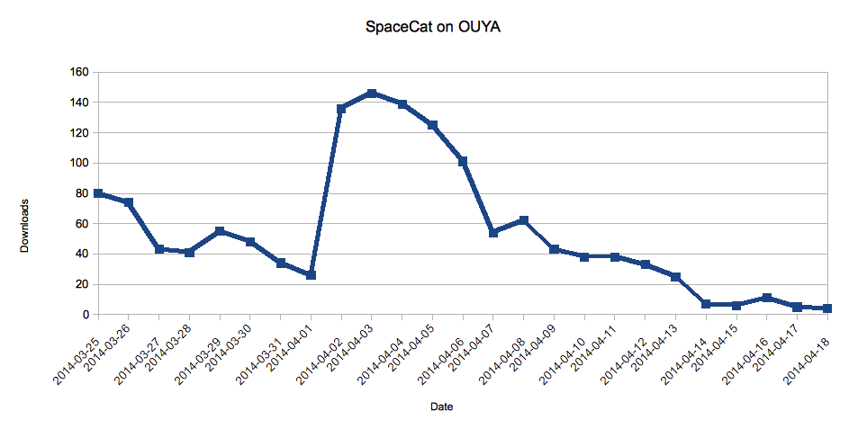
This is the chart of the downloads of SpaceCat during the first weeks on OUYA.
spacecat_ouya_downloads

We have a solid start on the first 2 days when there were ~75 downloads. This is when SpaceCat HD was on the top of “New Releases”. As you can see, the longer the users have to scroll to find you, the less downloads you get.

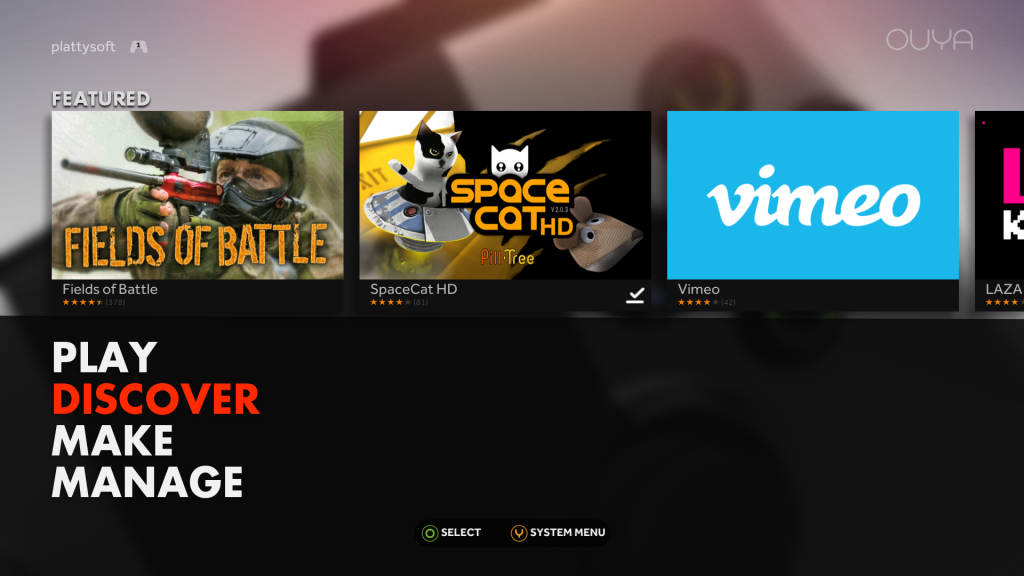
Then SpaceCat was featured. That put it on the front. It was the first thing you saw when you start your OUYA, literally the best spot, and it really made a difference: Over 125 downloads per day.
spacecat_featured_ouya

After a few days, the feature games rotate, and you can see how the downloads per day get down to just 50.

But here comes the last factor. Given the amount of people that downloaded (and played) the game, it also made it into the top 8 of the trending games, which helped it getting a decent amount of downloads. I’m proud to say that it even topped Final Fantasy III.
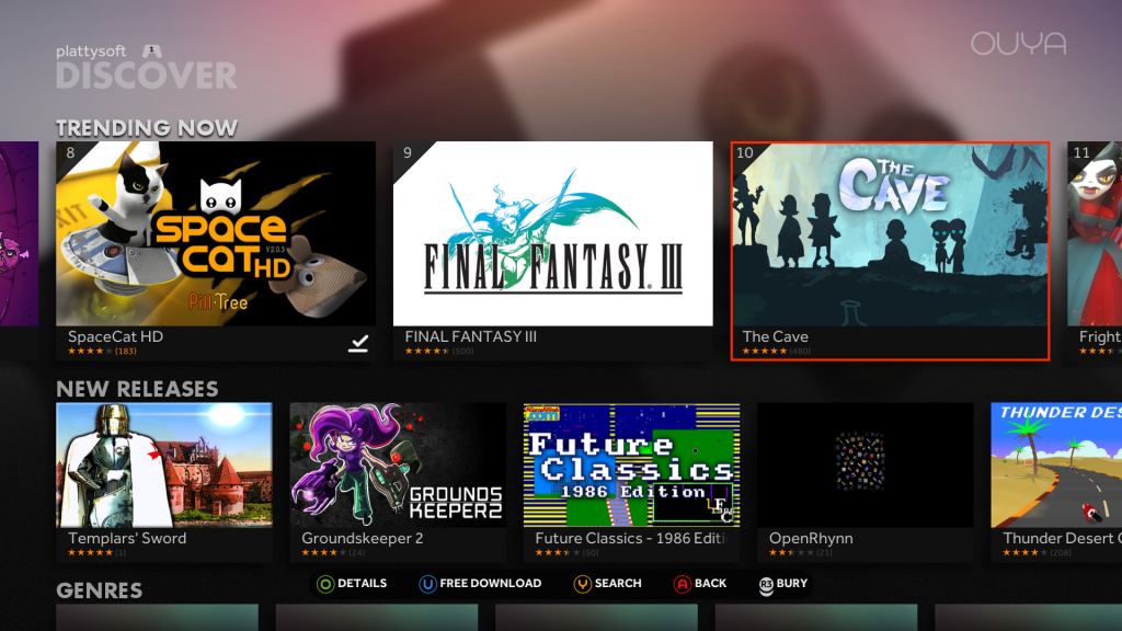
ouya_top8But after the featuring, and given that SpaceCat is a game you usually play for a week and you either finish it or get bored, it slowly disappeared from the top 30 and not it only gets a few installs per day.

How does it compare to Google Play?

The amount of downloads is in a complete different league. When SpaceCat was featured on Google Play (on 2012) it was getting over 50,000 downloads per day, 400 times more than on OUYA, Even today, SpaceCat (3D) get about 100 downloads per day.

But, partly because the monetization is different and partly because of the public is different, the percentage of users that purchased the game is way higher on OUYA than on Google Play.

The conversion of SpaceCat HD on OUYA is over 5%. Which is very impressive.

Also, there is the human aspect. The people from OUYA were a pleasure to work with: Diligent, responsive and professional. Google Play has improved that, but they still have a long road to go.

TL;DR;

There is a chicken-and-egg problem with OUYA: There are not many players, so it is not worth developing for it alone. Since there are not many games for OUYA (750 is still an impressive amount), it is not very attractive for players.

OUYA has the Free the games initiative to break the vicious circle. I like it, and I really hope they succeed.

If you have a game that already supports gamepads, you should totally port it to OUYA, it is not much work and it is a very rewarding platform. If you have a good game, the chances of being featured are very high, and that is always nice.

I wish there were more OUYAS out there so I could develop a game exclusively for them, but right now it is just not viable. Time will tell.
Android: Front Cameras are not Cameras

Let’s say you want to make an app that includes the occasional taking of a photo (i.e. for the profile pic) but you want to have it in-app and not launch the default intent.

Of course you follow the instructions for “Building a camera App” from the official website.

But there are a few points where the API is not obvious and can drive you mad. Specially if you are using a 2012 Nexus 7 as a test device (or any device that has front facing camera only).

Checking the hardware

Here is where the fun begins. Because this is not a killer feature, we won’t request the feature in the manifest, but check it in the code (as the documentation suggests)

getPackageManager().hasSystemFeature(PackageManager.FEATURE_CAMERA)

Returns false. So it seems there is no camera. Let’s try something else.

Camera.getNumberOfCameras();

This returns 1. It seems there is a camera. Hmmm.

The documentation takes us out of our error. FEATURE_CAMERA means:

The device has a camera facing away from the screen.

There is FEATURE_CAMERA_ANY, but that is API level 17, and we are “only” minSDK=14, so we can not use it. We also have FEATURE_CAMERA_FRONT, we are saved.

The way to check if a device has any camera is:

PackageManager pm = getPackageManager();
boolean backCamera = pm.hasSystemFeature(PackageManager.FEATURE_CAMERA);
boolean frontCamera = pm.hasSystemFeature(PackageManager.FEATURE_CAMERA_FRONT);
return backCamera || frontCamera;

Or just use Camera.getNumberOfCameras().

Be aware that if the camera feature is requested in you manifest, your app will not be available on devices with only a front facing camera. Maybe you want that, maybe not.

Opening the Camera

The fun continues when we try to open the camera. If we have more than 1 camera, we can select the one we want, but if there is only 1 camera we can go ahead and open it

if (Camera.getNumberOfCameras() == 1) {
    return Camera.open();
}
else {
   // Select one camera
   return selectAndOpenCamera();
}

Except that -in our special case- this code returns null. Because, you know, when it says camera it means back facing camera. At least the documentation of Camera.open() is clear.

Creates a new Camera object to access the first back-facing camera on the device. If the device does not have a back-facing camera, this returns null.

You should, instead, try to open the first camera, That works.

Camera.open(0)

In the case of selecting which camera to open (i.e. if you want a front facing camera by default) you have to iterate over the cameras, check the CameraInfo of each of them, and open the one you want using the id.

And remember: For Android, camera means back-facing camera. Front facing cameras are not real cameras.

The importance of a “Rate Us” dialog

Paid apps always had a better ratio of users leaving feedback than free ones, but in the case of MTG Tracker it was too much.

MTG Tracker used to have a very good ratio of users that leave comments. This was reduced when Google Play required G+ sign in to leave a comment, and that was specially bad for the free version, which was released after that change was made.

Things looked like this:

Screen Shot 2014-01-31 at 13.07.04

Both had good average rating, but while almost a 6% of the users leave a rating on the paid version, for the free one that number it is under 0.6%. Yes, 10 times less.

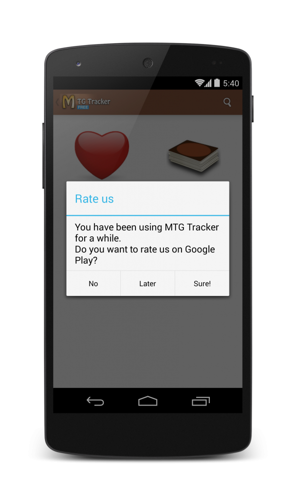
So, I decided to add a “Rate Us” dialog to improve that, knowing that the users of the app use it a lot and just may never thought of rating it.

mtg_rate_us_framed

I did not add it before because for a while I only had the paid app, which has a good amount of reviews. After one week, I went to check the results of the dialog. The stats looked like this:

Please note that the free version has much more installs per day.

Screen Shot 2014-02-06 at 12.09.30

So, almost 100 new ratings on the paid version and 35 more for the free. The conversion rate grow for both apps. Still the paid version got even more ratings.

I decided to let a few more days pass and checked again.

Screen Shot 2014-02-17 at 14.48.11

Another 80 ratings for the paid version and 40 for the free one. Also, average ratings for the paid app keep getting higher, but the ones for the free seem to oscillate.

As it turns out, the percentage of users leaving a rating on the paid app is almost the same as before the dialog was introduced, but the ratio of reviews for the free version has grown up to 0.7%, may not seem much, but the free app has 30% more ratings than before.

Conclusions

After this experiment, it is very clear to me that you must always add a “Rate Us” dialog, even if your current amount of ratings is good. Most users are lazy and will not rate your app unless you ask them to do it.

Some final notes:

  • Don’t be intrusive, if the user does not want to rate you, so be it. Always have a “No, thanks” option
  • Trigger the pop-up after a satisfying user experience, users will be more likely to give you positive reviews if they are in good mood.

Closing the conference season

It is time to close the conference season for this year. It has been a very interesting one, although I’ve spoken only at 4 places, they have been all very interesting.

GOTO Amsterdam: A very important software development conference in the Amsterdam edition, they had a mobile track, I guess I couldn’t miss it.

GDC China: My first time speaking at a GDC, where I presented my “Indie Game Developer Survival Guide”. Great experience, great city and great conference.

DroidCon Amsterdam: For the 3rd year in a row DroidCon celebrated its Dutch edition, and for the 3rd year on a row, I presented a talk there. I think I am holding a record on this one.

GDC Taipei: I was asked to repeat my talk from China at GDC Taipei. I am really humbled that they like it so much that they wanted it there. Also a great experience.

And for next year?

One of the great things of being an international speaker is that you get to travel a lot, given the sort of conferences I like and the expertise I have (Android & Game development) GDCs and DroidCons are where I find myself at home.

So, for 2014 I am sending talk proposals to:

GDC and GDC Europe: The bigger editions of GDC, held in San Francisco (largest) and Cologne, are my next targets to speak at. I want to be able to say that I’ve done the whole set and I’ve been told that the one in San Francisco is amazing.

DroidCon London and DroidCon Berlin: These editions are slightly larger and older than the Amsterdam one, and I’d like to see them first hand.

“Learn to Hoop” 1.0 Released

Platty Soft has a history of making apps for jugglers: First JuggleDroid, and more recently KendamApp – The Kendama App. Today, a new one is added to our family of juggling apps: “Learn to Hoop”.

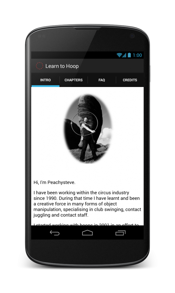
The app is an a tutorial for learning to juggle with hula hoops. with both textual explanations and videos. It is an adaptation of the educational DVD “Hooping” from Peachysteve.

intro_framed

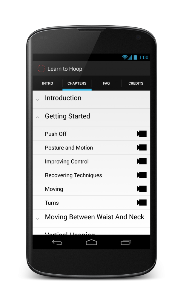
The app features almost 1h20m of high quality video among 7 chapters containing  51 lessons.

chapters_expanded_no_iap_framed

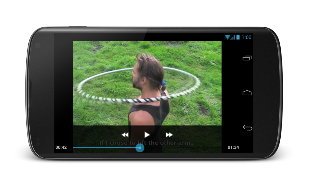
Subtitles show the instructions during the videos, and more detailed instructions are included separately for you to read at your leisure.

All videos are bundled into the app, so you can view them any time without the need for an internet connection.

video_framed


Get it on Google Play