Android: Front Cameras are not Cameras

Let’s say you want to make an app that includes the occasional taking of a photo (i.e. for the profile pic) but you want to have it in-app and not launch the default intent.

Of course you follow the instructions for “Building a camera App” from the official website.

But there are a few points where the API is not obvious and can drive you mad. Specially if you are using a 2012 Nexus 7 as a test device (or any device that has front facing camera only).

Checking the hardware

Here is where the fun begins. Because this is not a killer feature, we won’t request the feature in the manifest, but check it in the code (as the documentation suggests)

getPackageManager().hasSystemFeature(PackageManager.FEATURE_CAMERA)

Returns false. So it seems there is no camera. Let’s try something else.

Camera.getNumberOfCameras();

This returns 1. It seems there is a camera. Hmmm.

The documentation takes us out of our error. FEATURE_CAMERA means:

The device has a camera facing away from the screen.

There is FEATURE_CAMERA_ANY, but that is API level 17, and we are “only” minSDK=14, so we can not use it. We also have FEATURE_CAMERA_FRONT, we are saved.

The way to check if a device has any camera is:

PackageManager pm = getPackageManager();
boolean backCamera = pm.hasSystemFeature(PackageManager.FEATURE_CAMERA);
boolean frontCamera = pm.hasSystemFeature(PackageManager.FEATURE_CAMERA_FRONT);
return backCamera || frontCamera;

Or just use Camera.getNumberOfCameras().

Be aware that if the camera feature is requested in you manifest, your app will not be available on devices with only a front facing camera. Maybe you want that, maybe not.

Opening the Camera

The fun continues when we try to open the camera. If we have more than 1 camera, we can select the one we want, but if there is only 1 camera we can go ahead and open it

if (Camera.getNumberOfCameras() == 1) {
    return Camera.open();
}
else {
   // Select one camera
   return selectAndOpenCamera();
}

Except that -in our special case- this code returns null. Because, you know, when it says camera it means back facing camera. At least the documentation of Camera.open() is clear.

Creates a new Camera object to access the first back-facing camera on the device. If the device does not have a back-facing camera, this returns null.

You should, instead, try to open the first camera, That works.

Camera.open(0)

In the case of selecting which camera to open (i.e. if you want a front facing camera by default) you have to iterate over the cameras, check the CameraInfo of each of them, and open the one you want using the id.

And remember: For Android, camera means back-facing camera. Front facing cameras are not real cameras.

The importance of a “Rate Us” dialog

Paid apps always had a better ratio of users leaving feedback than free ones, but in the case of MTG Tracker it was too much.

MTG Tracker used to have a very good ratio of users that leave comments. This was reduced when Google Play required G+ sign in to leave a comment, and that was specially bad for the free version, which was released after that change was made.

Things looked like this:

Screen Shot 2014-01-31 at 13.07.04

Both had good average rating, but while almost a 6% of the users leave a rating on the paid version, for the free one that number it is under 0.6%. Yes, 10 times less.

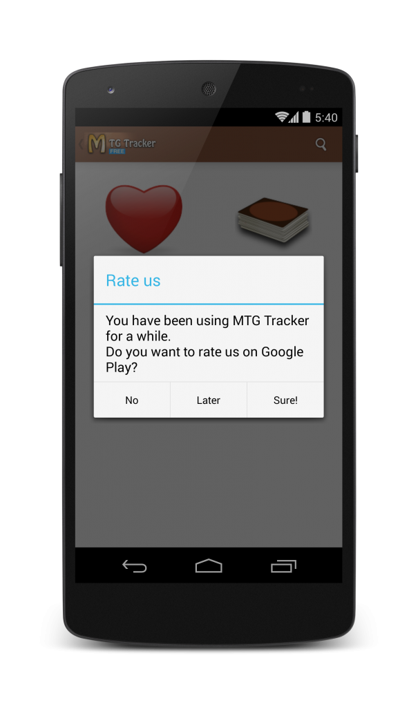
So, I decided to add a “Rate Us” dialog to improve that, knowing that the users of the app use it a lot and just may never thought of rating it.

mtg_rate_us_framed

I did not add it before because for a while I only had the paid app, which has a good amount of reviews. After one week, I went to check the results of the dialog. The stats looked like this:

Please note that the free version has much more installs per day.

Screen Shot 2014-02-06 at 12.09.30

So, almost 100 new ratings on the paid version and 35 more for the free. The conversion rate grow for both apps. Still the paid version got even more ratings.

I decided to let a few more days pass and checked again.

Screen Shot 2014-02-17 at 14.48.11

Another 80 ratings for the paid version and 40 for the free one. Also, average ratings for the paid app keep getting higher, but the ones for the free seem to oscillate.

As it turns out, the percentage of users leaving a rating on the paid app is almost the same as before the dialog was introduced, but the ratio of reviews for the free version has grown up to 0.7%, may not seem much, but the free app has 30% more ratings than before.

Conclusions

After this experiment, it is very clear to me that you must always add a “Rate Us” dialog, even if your current amount of ratings is good. Most users are lazy and will not rate your app unless you ask them to do it.

Some final notes:

  • Don’t be intrusive, if the user does not want to rate you, so be it. Always have a “No, thanks” option
  • Trigger the pop-up after a satisfying user experience, users will be more likely to give you positive reviews if they are in good mood.

Closing the conference season

It is time to close the conference season for this year. It has been a very interesting one, although I’ve spoken only at 4 places, they have been all very interesting.

GOTO Amsterdam: A very important software development conference in the Amsterdam edition, they had a mobile track, I guess I couldn’t miss it.

GDC China: My first time speaking at a GDC, where I presented my “Indie Game Developer Survival Guide”. Great experience, great city and great conference.

DroidCon Amsterdam: For the 3rd year in a row DroidCon celebrated its Dutch edition, and for the 3rd year on a row, I presented a talk there. I think I am holding a record on this one.

GDC Taipei: I was asked to repeat my talk from China at GDC Taipei. I am really humbled that they like it so much that they wanted it there. Also a great experience.

And for next year?

One of the great things of being an international speaker is that you get to travel a lot, given the sort of conferences I like and the expertise I have (Android & Game development) GDCs and DroidCons are where I find myself at home.

So, for 2014 I am sending talk proposals to:

GDC and GDC Europe: The bigger editions of GDC, held in San Francisco (largest) and Cologne, are my next targets to speak at. I want to be able to say that I’ve done the whole set and I’ve been told that the one in San Francisco is amazing.

DroidCon London and DroidCon Berlin: These editions are slightly larger and older than the Amsterdam one, and I’d like to see them first hand.

“Learn to Hoop” 1.0 Released

Platty Soft has a history of making apps for jugglers: First JuggleDroid, and more recently KendamApp – The Kendama App. Today, a new one is added to our family of juggling apps: “Learn to Hoop”.

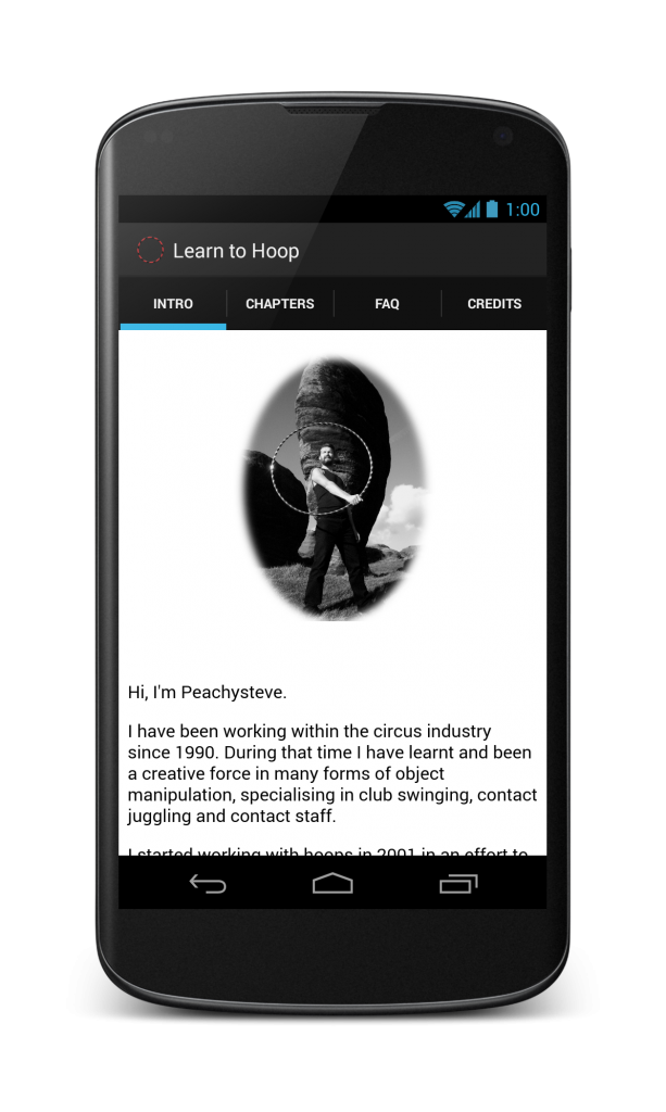
The app is an a tutorial for learning to juggle with hula hoops. with both textual explanations and videos. It is an adaptation of the educational DVD “Hooping” from Peachysteve.

intro_framed

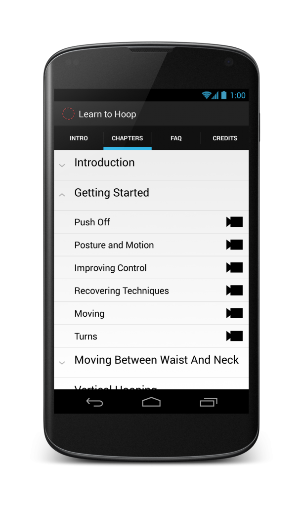
The app features almost 1h20m of high quality video among 7 chapters containing  51 lessons.

chapters_expanded_no_iap_framed

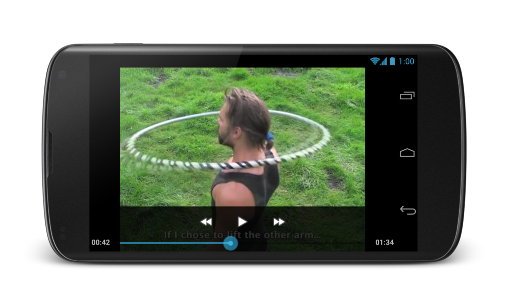
Subtitles show the instructions during the videos, and more detailed instructions are included separately for you to read at your leisure.

All videos are bundled into the app, so you can view them any time without the need for an internet connection.

video_framed


Get it on Google Play

SpaceCat returns in HD

Today I announce a new version of the most popular title of The Pill Tree. We bring you SpaceCat HD.

space_cat_hd_xxhpi

Back in 2011, when we were developing SpaceCat, phones did not had enough memory and we had to reduce the size of the textures to make the game playable. Some tears were spilled when downsizing the textures, but it was necessary.

Today, that is no longer a limitation. Modern devices can use the original textures without any problem, so we have put them back. Check the scenarios and how they look a lot better.

SpaceCat

device-2013-10-24-164530

SpaceCat HD

device-2013-10-24-164511

SpaceCat HD is a premium app, and it comes with a value pack:

  • Ad-free
  • Vents world is unlocked
  • 500 pills instead of 200 at the beginning of the game

But we didn’t just put better textures, we did some other upgrades to SpaceCat

  • Improved gamepad support (including Green Throttle)
  • Integration with Play Games
  • A revamped shop for spaceships and cats
  • Tips on the loading screen

Get SpaceCat HD from Google Play

The (Mobile) Indie Game Dev Survival Guide

The (Mobile) Indie Game Dev Survival Guide is the talk I presented at GDC China 2013.

Can an indie survive in the mobile world?

It may look like games for mobile is a paradise for indie developers, but truth is that it is quite hard to be noticed among the swarm of apps.

In this presentation, Raul shares the tips & tricks he has learned about how to survive as a mobile indie game developer for the past 3 years, including a post-mortem of all the games of The Pill Tree and also a post-mortem of The Pill Tree as a company.

MTG Tracker 5.3 Released

Another update for MTG Tracker, just in time for another pre-release.

First things first, the changelog:

  • Added Theros
  • Fixed crash filtering collection / wish list
  • Improved deck view with card details
  • Improved deck list with color and format
  • Improved flow for adding cards to deck
  • Price for a list now applies on the selection
  • Taping on a card on a list selects the proper set image

Now, apart from a few bugs on the collection / wish list section, all this one does is to improve the screens and the flow on the decks area. Because it is one of the most used features of the app, and I want to provide the best experience for the users.

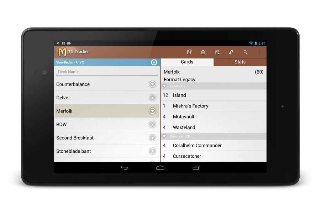
To notice how much of an improvement on the UI this version is, I have to show two screenshots. This is how it was until this version:

decks_deck_framed

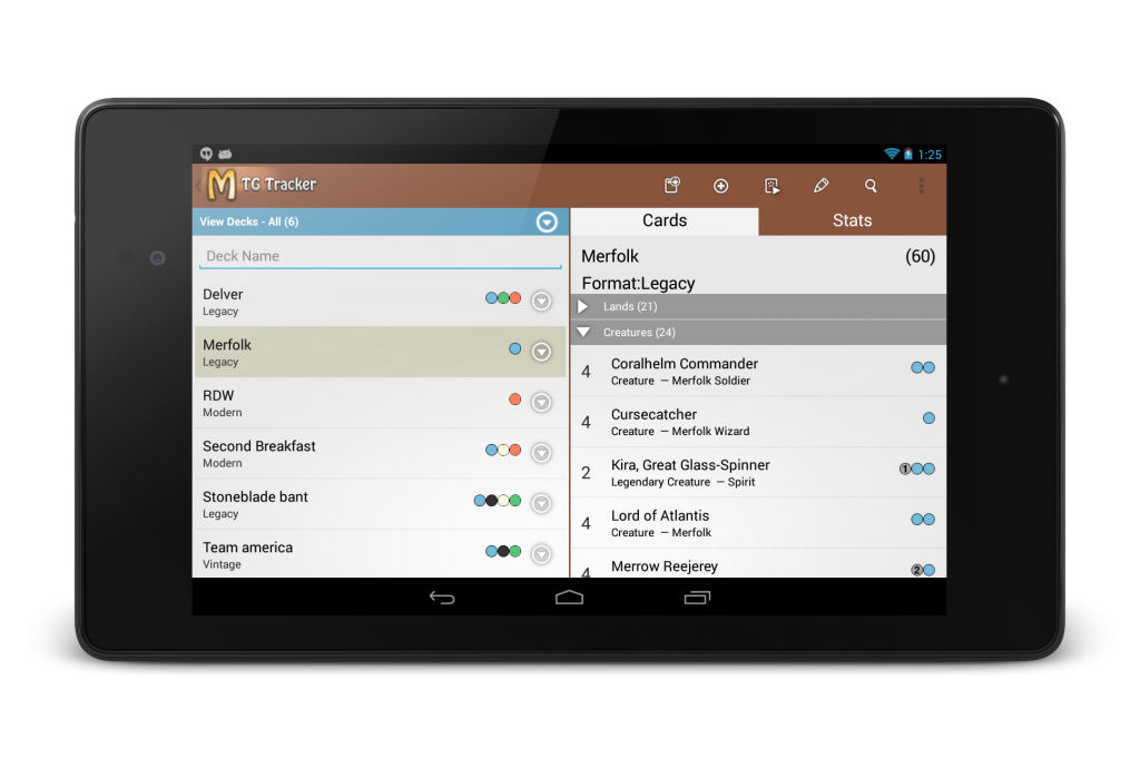
This is quite a nice screen with good information. Being able to see the deck list together with the details is nice, and it has been good for a long time, but with today’s release it looks like this:
decks_deck_new_framed (1)Now, each card on a deck has type information and casting cost… I can’t believe I had not added that before, now I can’t imagine that screen without them.

But also, for each deck, you can now see the format of the deck and the colors it uses. Because it is always nice to know that stuff.

cardshark_header

Speaking at GDC China

The talk “The Indie Game Developer Survival Guide” is part of the Mobile and Smartphone Games Summit of GDC China.

The talk is inspired by other guides like “The Hitchhikers’ Guide to the Galaxy” and “Zombie Survival Guide” and it is a compendium of the post-mortem of the games of The Pill Tree and a post-mortem of The Pill Tree as well.

The talk goes over the current mobile gaming landscape, the different business models, how they worked for us, lessons learned and tips so you can increase your chances of survival as an Indie Game Developer.

GDC is a great conference for game developers, be it USA, Europe or China, and I am really humbled that they invited me to speak there.

However, China is very far away, but for the ones in the Netherlands, I will be presenting a slightly different talk at DroidConNL this year: “The Mobile Indie Developer Survival Guide” which includes some more details about how apps do.

The slides will be available on Slideshare soon after the conference.

Displaying items in a grid with a header

The problem

Let’s say you want a layout that is a grid of items with a header. Something like this:

fashiolista profile

Displaying items in a grid is easy, we have GridView for that.

Displaying a list of items with a header is easy, we have setHeaderView on ListView for that.

The problem is when we want to show items in a grid with a header, since GridView does not support headers and ListView does not support columns.

This is a common problem and there are a few suggestion on StackOverflow, but none of them goes further than some guidelines. I did implement it and I want to share it so you don’t need to reinvent the wheel

From the architectural point of view, the solution is to use a ListView with a special adapter that displays the entries as separated columns.

How the code should look like

The code at activity level when you configure the view is like this:

ListView listView = (ListView) findViewById(R.id.listView);
listView.addHeaderView(createHeaderView());

adapter = new GidViewWithHeaderExampleAdapter(this);
adapter.setNumColumns(2);
listView.setAdapter (adapter);

Note that you add the header to the list view as a normal header, but set the number of  columns to the Adapter.

Extending from the right adapter

The adapter itself has to extend from GridViewWithHeaderBaseAdapter and implement some methods that are slightly different from the ones in a normal adapter.

Integer[] mArray = new Integer[] {1,2,3,4,5,6,7,8,9,10,11,12, 13, 14, 15, 16, 17, 18, 19, 20, 21, 22, 23};

private LayoutInflater mInflater;

public GridViewWithHeaderExampleAdapter(Context context) {
    super(context);
    mInflater = LayoutInflater.from(context);
}

@Override
public Integer getItem(int position) {
    return mArray[position];
}

@Override
public long getItemId(int position) {
    return position;
}

@Override
public int getItemCount() {
    return mArray.length;
}

@Override
protected View getView(int position, View v) {
    if (v == null) {
        v = mInflater.inflate(R.layout.simple_list_item, null);
    }
    TextView tv = (TextView) v.findViewById(R.id.text);
    tv.setText(String.valueOf(getItem(position)));
    return v;
}

So getItem and getItemId are the same as for normal adapters.

On the other hand getItemCount is a replacement method for getCount and getItemView is a replacement for getView. both are implemented on the GridViewWithHeaderBaseAdapter and are the methods that do the magic.

Handling click on items

The adapter creates a LinearLayout and adds child views to it for each row, creating a single list item for each row.
Then, of course, OnItemClickListener is broken, because each list item is a row. You have to use GridItemClickListener instead.

@Override
public void onGridItemClicked(View v, int position, long itemId) {
    // TODO: Handle item click here
}

Advantages versus TableLayout

What is the advantage of this solution versus just a TableLayout on a ScrollView?

The advantage is that the Adapter recycles the views and it is a lot more efficient in memory and in execution.
The other advantage is that the Adapter is dynamic. You can not hardcode a TableView without knowing the items beforehand. Sure, you can build it programatically, but if you are getting that far, you probably want to get one step further and build an adapter, which is what I made.

GridViewWithHeaderBaseAdapter is about 150 lines of code, so feel free to look at the source for inspiration and/or modify it for your own purposes, it is under BSD license.

You can check the project on github. It includes the example.

MTG Tracker 5.2 Released

A new set of Magic the Gathering is out, and a new version of MTG Tracker comes with it. This time it is Magic 2014 Core Set.

With this version the playtesting feature includes Library manipulation, the key part that was missing (and that many people kept asking on the reviews on Google Play)

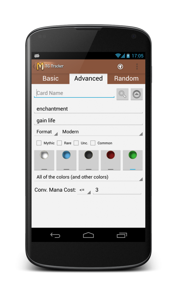
Also, a subtle change in the UI of the advanced search. It was like this:

Advanced search example

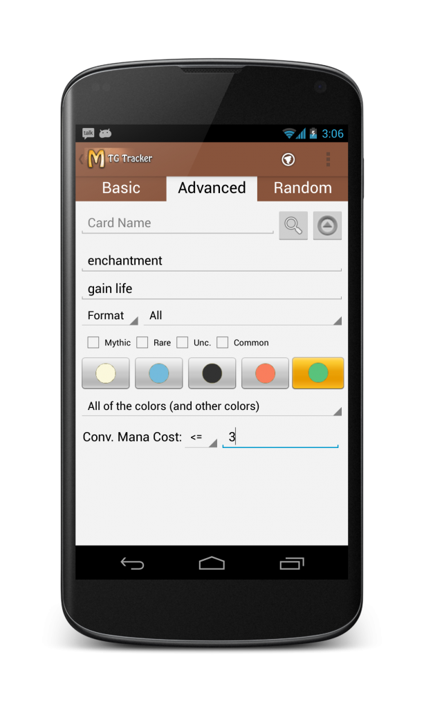
The icons for color selection were bad, it was not trivial to see when they were selected and they had a very old design and did not fit with the new tendency towards flat design, so I updated them.

The sort of change that is barely noticeable, but it works. It looks like this now:

new search

Full ChangeLog of MTG Tracker 5.2:

  • Magic M14 Core Set
  • Library manipulation on playtest
  • Fixed reset of playtest on device rotation
  • Fixed problems with format search on Spanish / German / French
  • UI update on Advanced search

cardshark_header