AppAffinity goes out of Beta!

It has been a while since we released AppAffinity. It has been out in the wild for a few months and without any effort on advertising from our side it has grown over 1,000 users. Quite a success.

For the past week, I got LoopBit involved again on a new iteration, tweaking the UI using the suggestions we received and solving the bugs user reported. Now we believe AppAffinity is ready to go and we have removed the beta tag.

Now it is called just AppAffinity.

What’s new?

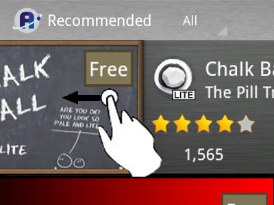
People asked to see the details of ratings of every app. Many were upset that apps without the banner had more information. We did not want to add clutter to the banner because the designers put a lot of effort on them looking nice, so we added a detail view you can get swiping to the left

We also added a few animations, which you will notice as soon as you open AppAffinity.

The ability to filter the installed and blocked apps was also requested, and it we included it as well.

And I won’t bother you with the other performance improvements and minor bug fixing.

Sincerely, the AppAffinity team.

Codemon: The Backstory

It has been a while since I published Codemon on Google Play, and I have been updating it quite often. I originally talked about why I made Codemon in my personal blog, in Spanish. I got many requests to post it in English, so here it is.

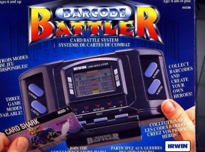
The story starts a while ago: It was the 90s and there was a TV commercial (at least in Spain) about something called “Barcode Battler”. It was a portable console you could scan barcodes with, which turn into creatures you used to battle each other. Sounds familiar?

I loved the concept, but back then I was a student with little money to spare so I never got my hands on one of those. Instead, the concept of the game got stuck in my head, where it kept being an amazing game, and since I never played it, it didn’t have any flaws or limitations.

Fast forward to the arrival of smartphones. The first time I saw a barcode scanner that used the camera of a phone the concept came back to me. I thought that the game could be done for phones, so I searched it. What I found was Barcode Beasties, which is a similar concept but the gameplay was really limited and the UI was “not so good”. My inner geek was urging me to build a better barcode game, but I had a full time job… until I resigned.

Then it came The Pill Tree, a gaming studio I co-founded with a friend. The idea of building a game based on scanning barcodes was always there. In fact we had a prototype of a game called “DNAPets” (working name) which at the end was pushed out by SpaceCat. Once SpaceCat was done, there was no continuity on The Pill tree and the idea was “abandoned”.

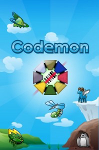
Then I started Platty Soft, and this project was always there. Taking time from here and there I was able to build prototypes and test them. The idea evolved again to something more of a “Pokemon” style and therefore the name Codemon (Barcode Monsters) the monsters you find on barcodes.

The last obstacle was the lack of a designer since day 1. A pet/monster game has character design as a cornerstone, and any game needs a nice UI. Hire someone for a personal project, not knowing how (or if) it is going to work out and running it on your own money was a difficult decision. But then I realized that it was either that or abandon the project, and I had invested so much time and illusion to trash it now.

Finding a designer was not easy and I must say I was lucky with the ones that got worked with me, and very happy with the result as well.

All in all, there have been more than 3 years since I got struck by the idea, and around 20 since the seed was planted. The final result is a game where you scan barcodes to find Codemons which you can battle other players with and level them up (and collect them as well) if you haven’t tried it yet, I encourage you to do so.

Android Development Course in Amsterdam

After having done 3 successful Guru Session about Android with Appsterdam and given some formal training via the Appvertising Agency, I think it is time to go one step forward.

There is a complete lack of Android training courses in Amsterdam. I want to change that. I want to provide expert Android training for IT professionals.

Ok, so, let’s answer some questions about this first Android Development Course in Amsterdam.

How long?

5 days (Monday to Friday), 8 hours a day (most likely 9:00 to 17:00 or 10:00 to 18:00).

Less time will not give proper in-depth training. I expect the attendees to be able to build full REST applications with a persistent database and adaptative interfaces for both phones and tablets at the end of the week

Do you have a program?

Some topics that will be covered are:

  • Activities & Intents
  • Layouts & Resources
  • Lists & Adapters
  • Asynchronous / Background tasks
  • Network communication
  • JSON / XML parsing
  • Content Providers
  • Fragments
  • Action Bar
  • Adapting apps to tablets

How many slots?

I want a group of 10-12 people. Less will be too expensive for them and more will not allow me to dedicate proper time to each of them.

Where?

I am talking with several locations, but BouceSpace has a lot of possibilities to be the one.

When?

Not sure yet, but I’d like to do it before the end of 2012, proposed dates are December 10th to 14th.

How much?

This is still undecided, but I believe it will be around 800 euros per person. Food will be -almost definitely- included

How do I RSVP?

Just follow the link to the event page on EventBrite, or just contact me if you are interested but not completely sure yet.

Android Design Patterns and Tools: Recap and slides

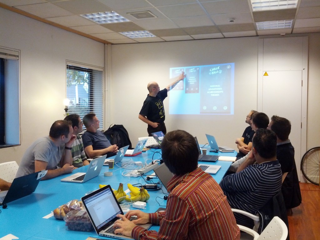
Past Saturday we held a Guru Session about Android Design Patterns and tools at Appsterdam. The topic is very interesting and so more than 15 people showed up with their laptops ready to learn more about it and, of course, talk about the topics and get their hands into some code to try it out.

I started talking about how to use one layout for all devices and how to adapt it, giving Chalk Ball as example (thanks to Matt for the photo) and moved over other topics as Master-Detail architecture, ActionBar and how to save time when testing on devices.

You can check all the slides here:

This time there was less bootstrapping new projects and more playing with the concepts, but all in all it was fun to run it and based on the comments, attendees learned new ideas and enjoyed it as well.

Piracy on Apps, Bubbleconf and slides

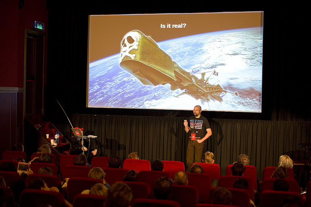
Past Friday I went to Bubbleconf and I gave a lightning talk about Piracy on Apps. I already wrote about it in this blog entry.

Here’s a photo of the conference, you can see all the photos of Bubbleconf in flickr.

We used the Pecha Kucha style for the talks, 20 slides, 20 seconds each. It was the first time I tried such a method. While I was expecting to dislike it, it was not that bad, in fact I sort of liked it.

And of course, the slides of the talk, it just took 6m40s to deliver it

The conference was held in the Pathé Tuschinski theater in Amsterdam, an amazing venue. All in all, an interesting day.

V Hack Android Recap

This weekend (15-16 September) the Dutch edition of “V Hack Android” event was held at Bouncespace in Amsterdam.

This event in particular was organized by the Dutch Android User Group, which made a great job at everything over the weekend, and co-organized by Appsterdam which helped with the location. Being an active member of both communities I was pretty much forced to attend it :)

The Team: Apps’R’Us

Each team was composed by 3 members. My partners for the weekend were Ronald van der Lingen, who I knew from the time I freelanced at Layar and is a very enthusiastic Android developer and Ron Jones, who I knew from some Appsterdam meetups and is a designer with lots of interest in mobile apps.

Since all the names start with R, the name of the team became Apps’R’Us, which turned out to be quite popular name when I searched it on the Internet after the Hackathon.

The Project: Appy Birthday

At the hackathon we were presented 4 topics (Birthday, NFC, Health and European Culture) and we were given time to brainstorm about it and pitch on Friday.

We tried to think of an idea that combined NFC and birthdays, but we could not come up with anything interesting. Then we went for Culture + Birthday and we were almost decided to make an app that showcases famous people that have a birthday today and what have they done, but then decided to change it completely.

The final idea is an App that shows you people that have installed the app that has the birthday today, and you can say “Appy Birthday” to them. The other person will receive a push notification and will be able to see all the people that send a birthday wish to them.

We really liked the idea of an act of kindness to random people that have Android phones as you do. We thought it fit the theme of the Android birthday and it was fun.

The Hackaton

I really liked that we cut it down to a Minimum Viable Product and that we could finish the basic functionality over the weekend. Appy Birthday is even published on Google Play, although it is a bit rough around the edges.

It was very nice to work with my teammates, both are people I knew but never had the chance to work closely with them.

Lots of work, but also fun and inspiring… and lots of unhealthy food over the weekend.

The Result

We ended up in second place, although the idea was fun and well executed, there was no way you could make a business plan out of it.

The winning project was “Food!” from Team Wasabi. It is an app where you can put your food preferences (what you like to eat and what you can’t eat) and when you are going to have a group meal you do a sync of all the people involved via NFC and get a common list of ingredients to decide over the menu.

Their demo was really awesome. Although I like our project and I am very happy with it, the way they implemented the idea was really cool and fun and they deserved the victory.

Well done Team Wasabi! Make us proud in London!

Thanks DutchAUG for making this possible!

The photos used on this entry and more photos of Geeks eating unhealthy food and working non-stop can be found at the official page of the event in Google Plus.

AppAffinity: Find apps you’ll love

The problem with visibility

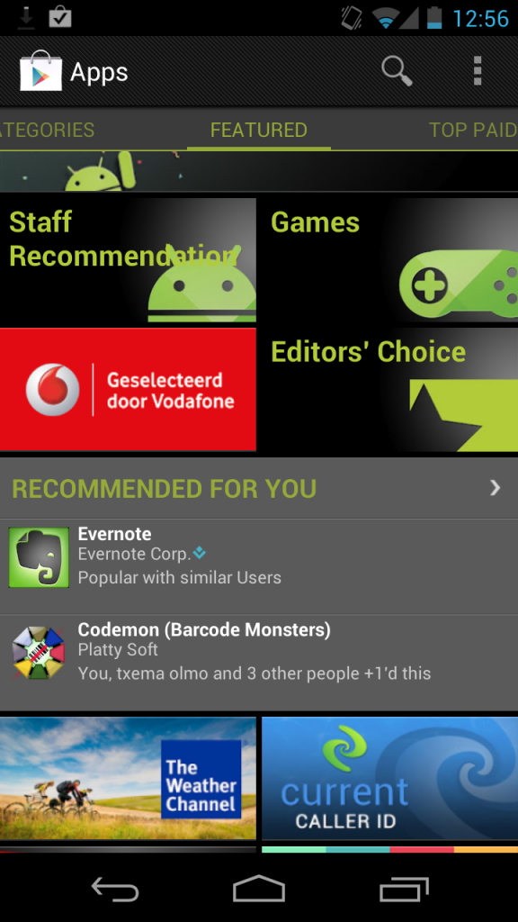
Visibility is really a big issue on the mobile app industry, specially on Android. In other words: There is a lack of proper discovery mechanisms to find new apps.

As a developer you can minimize the impact of this by targeting a niche and then promote your app “outside” the app store. That works. But if you want to create something for the mass market -as a game- this issue is really important.

As a user you can rely on the featured section of Google Play, which, many times, will not be interesting for you. Alternatively you can browse all the 7 tabs of Google Play trying to find something interesting. Not very appealing, right? You can also follow some specialized blogs, which takes lots of time.

So, the lack of visibility on Android is a big issue, and that is what AppAffinity tries to address. Many people are working on solving this. Why is our solution better?

What is exactly AppAffinity?

AppAffinity is an app that recommends other apps.

Not just “any” apps. We believe Personalized Recommendations are the solution.

The apps you keep installed are the ones you really like and use, and we use them to generate a list of recommended apps. A personalized list for you.

We did not want to create yet another app store. We wanted to create a tool to help you discover new exciting apps. Think of AppAffinity as the “Recommended for you” tab you always missed on Google Play.

We believe that less is more, so AppAffinity does ONE thing: Show you a list of new apps recommended for you. And we focus on do it in a delightful and efficient way.

Excited about AppAffinity? Register for the beta on this page.

AppAffinity is a collaboration project of PlattySoft and LoopBit.

[AppCrafting] Design Vs Development

I say in one of my talks that development is not the most important part of making apps since design is at least at the same level. In this post I want to give some insights of what I mean. Let’s imagine that there is something I want to do with my phone and I check if there is an app for that.

Your first problem should be some sort of SEO equivalent: You want to appear high in the lists for the common related search terms. But lets imagine you have that sorted out.

The user has a problem, searches for a solution and finds two (or more) suitable options. Obviously people are going to install one first, and if that app works fine for them, they are very likely to stick with it and not even try the second one. They will only seek for a replacement if they are not completely happy with the initial choice.

The first choice

Which app will users install? The one they expect the most from. I don’t know how the decision is done for sure, but there are two important factors:

  • Average rating & number of ratings
  • Visual aspect

These two factors can combine in many ways, and that will depend of each user. This means that a not very good looking app with lots of good ratings has a chance of being installed and an app with gorgeous screenshots and few ratings has a chance as well.

Since the ratings are not under your reach, your safer bet is to attract users with a great design.

If the first choice they make looks pretty enough and works nice enough they are not going to bother trying other app, but what will happen when one of them is not sufficient?

The seek for a replacement

You may get more reviews if you were there first (a.k.a no other option) but if your app has a clumsy UI users will not be completely happy and from time to time they will look for an app with the same functionality but better looking. In this case the design is important to keep a leader position by not making people want to look for a replacement.

On the other hand, let’s imagine that you have the best looking app. You have a lot done. A bunch of people is going to install it based on the featured graphic, screenshots and so on, but here is when development comes into play.

A nice design is going to bring you users, but it is the functionality of the app which is going to keep them with it. Again, if your app looks pretty and works nice they are not going to bother trying other app, but what will happen if the app is slow, crashes, misbehaves or misses key features?

The delusional moment

What happens in that the app does not fit the expectations and then the users are going to be frustrated. It is very clear to me that two things will follow:

  • They are going to try the other app
  • They are going to give you bad ratings

A nice design puts high expectations (as a high rating does it as well) and if your screenshots put the stakes high and the development is not on par then the frustration is going to be much bigger.

A user that has an app that works and replaces it with other that is better looking will give a good review to the second one (he is not necessary frustrated), while a user that replaces a bad developed app with another one that works is more likely to leave a bad review on the first one. A frustrated user is very likely to give a 1 star rating.

People want apps that look nice and work fine, there are thresholds for both characteristics. But while in one case you may be giving a good review to a competitor, in the other you are risking a bad review to yourself. It is harder to frustrate a user with a mediocre design that works than with a nice design that fails.

And then the snowball effect of bad reviews will roll and the design will be more and more irrelevant in the decision process of being the first choice.

That’s why you should care a lot about the design, but never, ever, put development in a lower place.

Note: This post was inspired by the official Magic the Gathering(r) app and how it states to already existing apps such M:tG Tracker.

Tools for developing Android Games: The Slides

The session of yesterday co-organized by Appsterdam.rs and the Dutch Android User Group was a great success. We had over 20 people showing there, many of them told me that it was interesting and fun, and they also learned new stuff, so mission accomplished!

During the Hackaton we had quite some game ideas that were developed to a certain extent (we only had 5 hours). These projects even did a demo at the end:

  • A fast paced 2D scrolling combining tilting controls and jumping. We had a demo with the basic gameplay.
  • A Space flight simulator in 3D using the free NASA 3D models. We saw it working with touch, control it with the sensors was the next step.
  • 3D pong, it was almost working, all the scenery was there and displayed and the ball was moving.
  • 2D Real time strategy. They had the tiled map working and all the game logic implemented (but not displayed). They promised to finish it by next week.
  • 2D Billiard with fling controls. Almost completed, you had to hit the other 2 balls with yours, they you get the point.
And, as the title for the post says, here are the slides:

Latest talks: Microsoft GeekNight & Delft University

Over the past months I have given some talks. The last ones have been at Microsoft TechDays and Delf University. Very different environment and public.

On February 15th there were the Microsoft TechDays. There  I presented “The importance of Visibility” during the GeekNight. I am going to update that talk soon with the latest results from SpaceCat (and the levels of being featured) and probably change the title to “Fly or Die: App Visibility”

And on March 20th I have spoken at Delft University as part of the App Symposium presenting “The Road to Publishing”, trying to motivate students to build their own product.

And of course, this Saturday there is the Tools for developing Android Games.

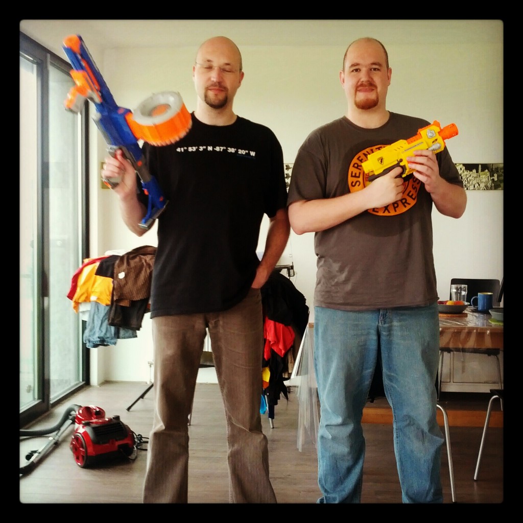
Photo by Erik Romijn